You're probably looking at a property that functions well enough but doesn't read the way you want it to. The pavement is clean, the irrigation runs, the shrubs are alive, and yet the site still feels flat. Prospects notice it before they can explain it. Tenants feel it every morning on the way in. Visitors read it as age, inconsistency, or a lack of attention.
That gap often comes back to color.
On commercial sites across Dallas–Fort Worth and San Antonio, a strong site color palette does more than make beds look better for a few weeks. It helps a property feel current, organized, and intentionally managed. It can support brand identity, sharpen first impressions, and make hardscape, signage, and architecture feel like part of one system instead of disconnected pieces.
Table of Contents
- Why Your Landscape Color Palette Is a Business Asset
- Core Principles of Landscape Color Theory
- Developing Your Strategic Palette
- Ready-to-Use Commercial Landscape Palettes
- Texas-Tough Plant Selection for DFW and San Antonio
- Implementation and Lifecycle Management
- Budgeting Your Commercial Color Program
Why Your Landscape Color Palette Is a Business Asset
Put two office parks side by side. One has scattered plant color, fading annual beds, and hardscape that doesn't relate to the building. The other uses a disciplined outdoor color palette that ties together entry monuments, seasonal beds, foliage tones, and pedestrian routes. The second property usually feels more expensive to lease, easier to trust, and more actively managed.
That response isn't accidental. Commercial property managers rarely ask how planting color palettes affect brand consistency and curb appeal metrics for office and retail properties, even though color contrast influences visual attention and perceived property value. There are also no recent studies from 2024 to 2025 quantifying ROI for strategic commercial planting color in Dallas–Fort Worth or San Antonio, according to this University of Florida publication note. So the business case has to be made the way property managers work. Through leasing impressions, renewal conversations, site tours, maintenance stability, and how the property holds up month after month.
Curb appeal affects leasing conversations
A prospect doesn't separate “the grounds” from “property quality.” They read the whole arrival sequence as one experience. If the planting palette clashes with the facade, if entry beds are too loud for a professional office environment, or if everything turns dull at the same time, the site feels unmanaged even when maintenance crews are showing up.
Color helps solve that in practical ways:
- Entry hierarchy: Stronger contrast at primary entrances helps direct attention where you want it.
- Brand alignment: Repeated tones across signs, paving, containers, and planting make the property feel intentional.
- Perceived upkeep: Coordinated color looks maintained longer than random plant swaps do.
Practical rule: Commercial landscape color should support the lease story. If the site says “dated” or “chaotic,” the market hears it before your team speaks.
Better color choices reduce visual drift
Many commercial grounds decline visually long before they decline horticulturally. Plants survive, but the palette loses structure. Bright flowers get replaced with whatever is available. Shade and sun areas drift apart. One corner reads warm and energetic, another reads cool and washed out, and the property stops feeling unified.
That's why color should be managed as an asset, not treated as seasonal decoration. On high-traffic properties, consistency matters almost as much as impact. A well-run palette gives you both.
Core Principles of Landscape Color Theory
A commercial exterior color palette works a lot like a chef's spice rack. You don't need every possible ingredient. You need the right set, used in the right proportion, so the final result tastes balanced instead of noisy.
Color harmony matters more than color quantity
Most commercial sites don't fail because they lack color. They fail because they use too many unrelated colors at once.
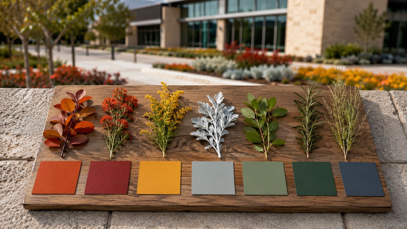
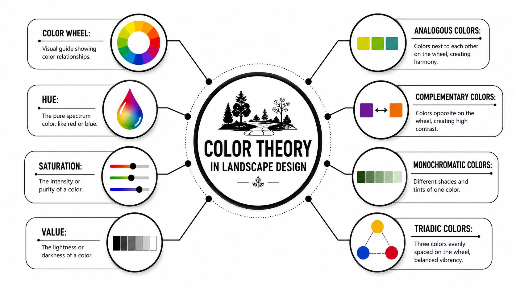
A technically optimized palette uses a split-primary foundation. That means warm and cool versions of red, yellow, and blue, then earth pigments such as Burnt Sienna and Yellow Ochre to keep the result natural instead of garish. That structure can mix approximately 30+ distinct foliage and soil neutrals, according to this palette analysis. In terms of natural composition, that matters because mature sites aren't made of one green. They're made of olive, blue-green, yellow-green, gray-green, bark brown, stone tan, and shadow tones that all have to work together.
For property managers, the takeaway is simple. Refined outdoor spaces usually rely on restrained mixing, not more flowers.
A few usable harmony approaches:
- Analogous schemes: Colors that sit near each other in feel, such as blue-green, green, and yellow-green. These are calm and easy to maintain visually.
- Complementary schemes: Opposing color families, such as purple against yellow-green. These create energy and focal points.
- Monochromatic schemes: One hue used across lighter and darker values. These work well where you want the setting to feel quiet and controlled.
Temperature and value drive how a property feels
Color temperature decides whether a site reads as warm and active or cool and composed. Value decides whether it feels heavy, bright, shaded, or open.
Warm tones often fit hospitality, retail frontage, and entertainment uses. Cool tones often fit medical campuses, office courtyards, and places where you want a calmer pace. What doesn't work is mixing warm and cool plant material randomly and expecting the site to feel coherent.
Here's the practical lens teams use in design review:
| Element | What to evaluate | Common mistake |
|---|---|---|
| Hue | Is the dominant color family aligned with the property identity? | Picking plants based only on bloom color |
| Value | Do light and dark masses balance across sky, foliage, and hardscape? | Using all mid-tone material so nothing stands out |
| Saturation | How intense should the site feel from the street? | Overusing bright annuals in professional settings |
| Temperature | Should the space feel cool, warm, or neutral? | Mixing silver foliage with warm florals without intent |
If the architecture is already busy, the planting should usually get quieter.
On commercial sites, color theory isn't academic. It's a control system for visual order.
Developing Your Strategic Palette
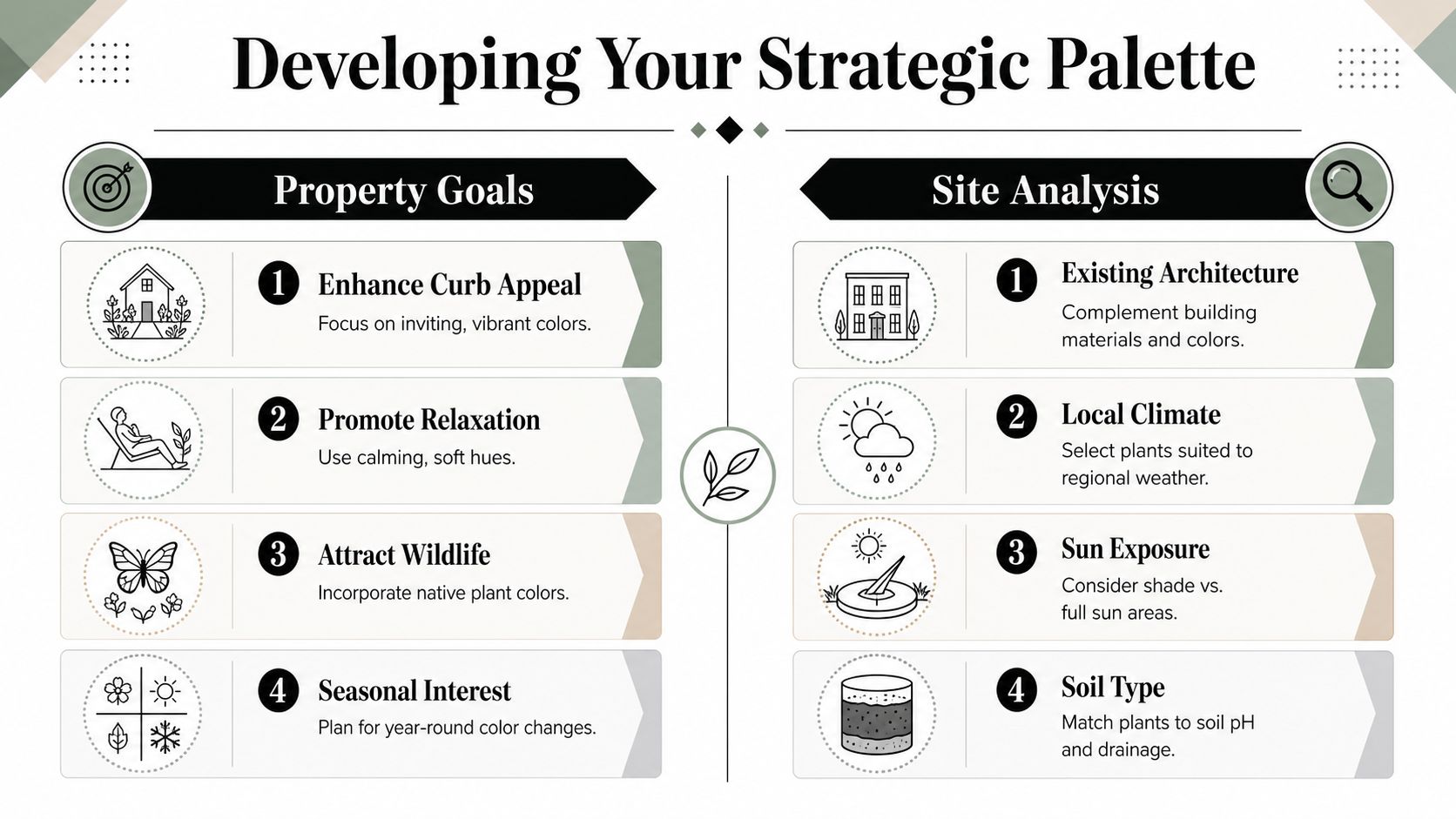
A good outdoor color palette doesn't start with whatever is blooming at the nursery. It starts with the property's job. Leasing office. Medical building. Industrial park. Retail frontage. Hospitality arrival. Each one needs a different visual message.
Start with brand, not flower catalogs
The strongest commercial palettes translate brand identity without becoming literal. If a company logo uses blue and orange, that doesn't mean every bed should be planted in blue and orange blooms. It means the site can borrow the brand's emotional register. Cool and precise. Warm and welcoming. Modern and restrained. Regional and grounded.
A practical review usually starts with these questions:
- What should the property feel like on arrival? Calm, upscale, energetic, established, contemporary.
- Which materials already dominate? Brick, precast, limestone, glass, dark metal, warm stucco.
- Where does color need to work hardest? Main entries, monument signs, tenant patios, perimeter streets, pedestrian connectors.
Then the palette gets assigned by role, not by plant list alone. One color family leads. Another supports. A third appears only at focal points.
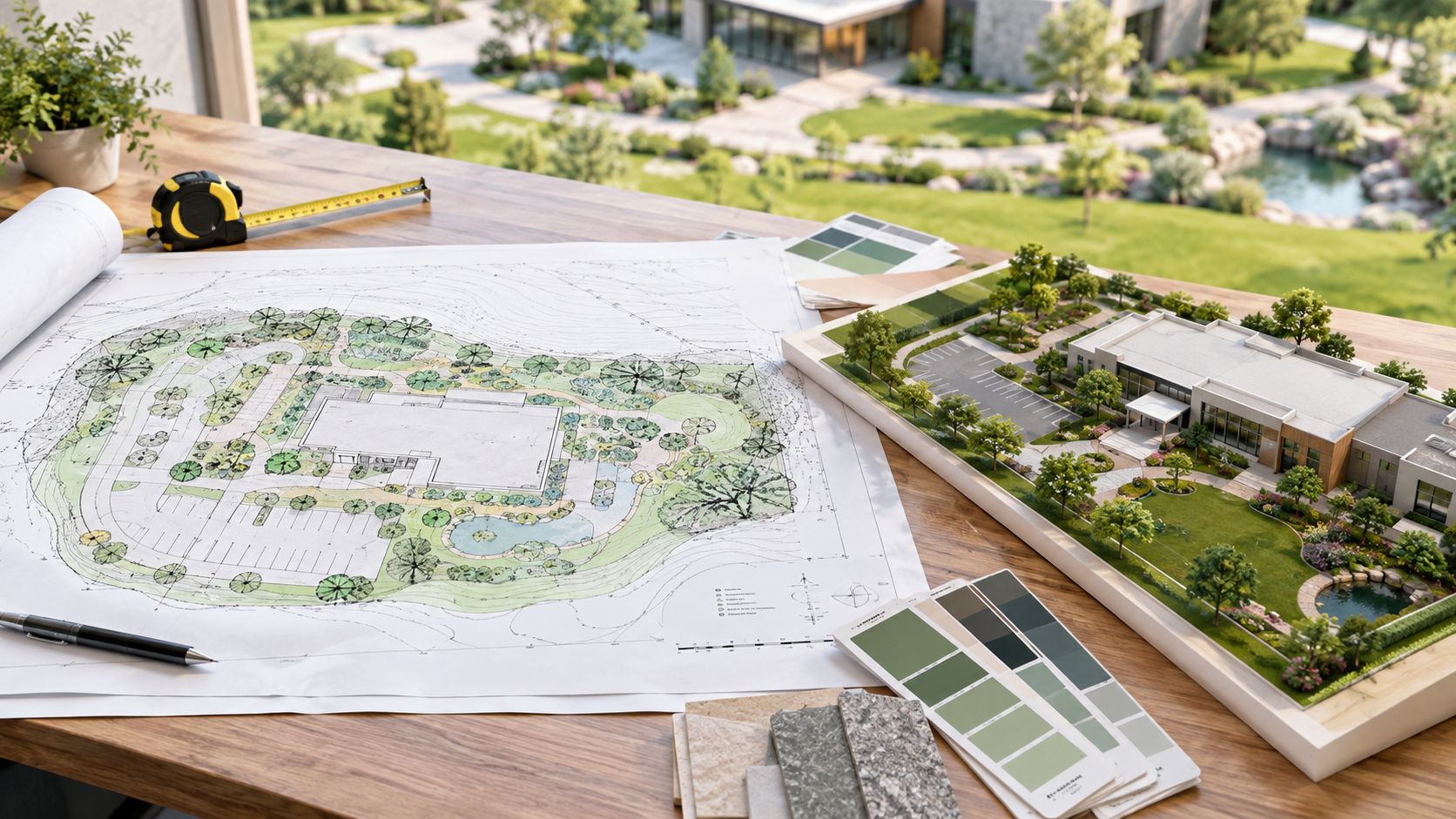
To aid in planning, before installation, many managers find it useful to visualize Zen garden exteriors or comparable concept renderings to test whether a restrained palette will feel elegant on their specific architecture or too quiet from the street.
Plan for seasons and trend timing
A strategic palette also has to hold up through the year. In Texas, that means accounting for heat stress, long summers, sudden cold snaps, and the fact that a palette can collapse if all the color comes from one seasonal changeout.
That's why the best commercial programs spread color across multiple layers:
- Structural color from hardscape, walls, gravel, mulch, and containers
- Foliage color from shrubs, grasses, and perennials
- Seasonal accents from annual rotations or focal beds
There's another useful planning angle. Industry analysis of Colors of the Year found a cyclic pattern in which average Lightness repeats about every 8 years and average Chroma repeats about every 4.5 years, according to this research on color trend cycles. For commercial properties, that doesn't mean chasing trend colors. It means understanding that markets move in recognizable waves between lighter and darker palettes, and between muted and more intense color.
A property manager can use that idea without being trendy. Refresh hardscape and perennial choices around stable brand colors, then let seasonal beds absorb smaller changes in market taste.
The safest strategy is usually stable structure with flexible accents.
Ready-to-Use Commercial Landscape Palettes
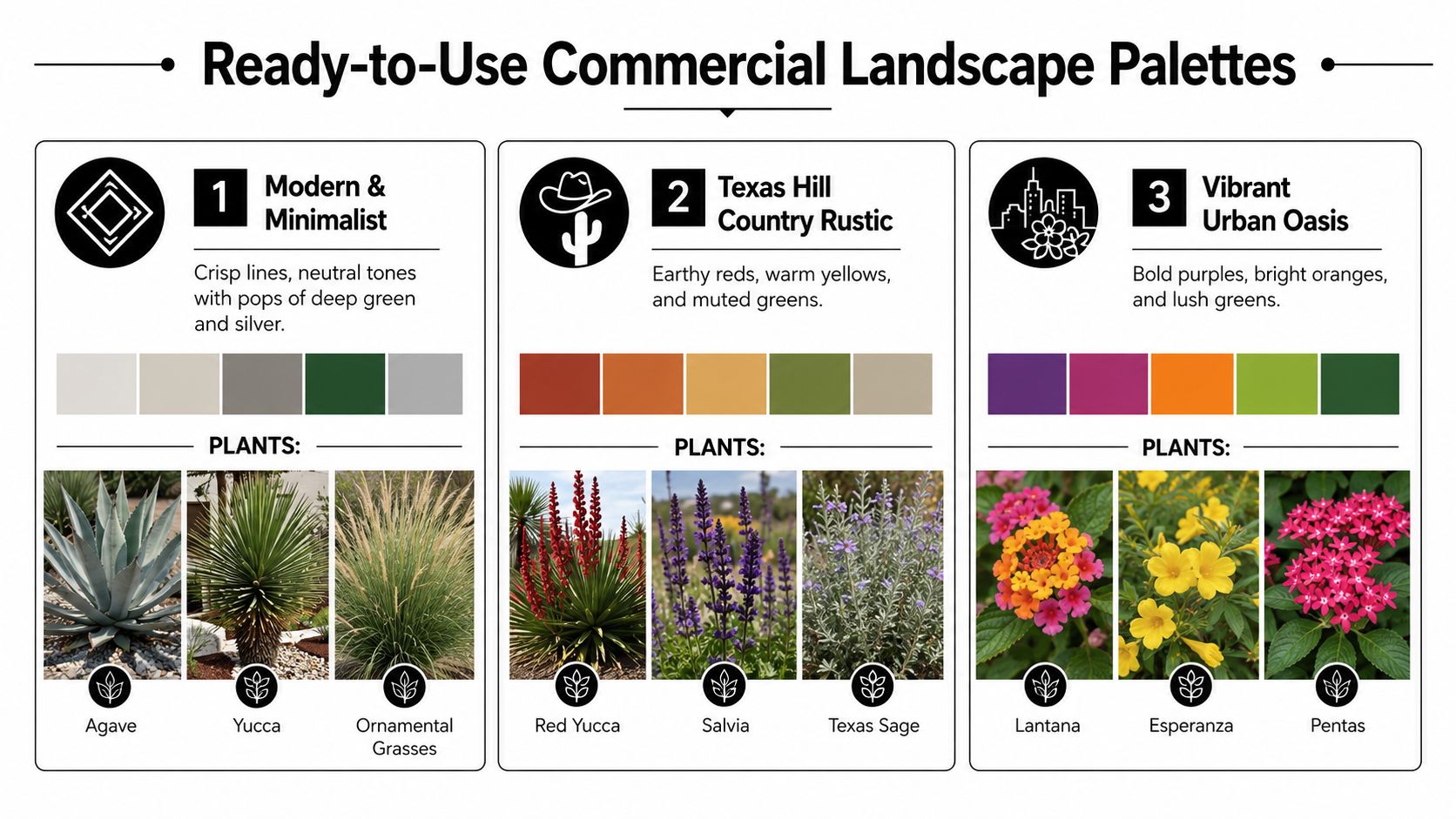
The easiest way to judge an outdoor color palette is to see how it behaves on a specific property type. These examples are built for commercial use, not for show gardens.
The modern industrial campus
This palette works when the architecture already carries strong lines, metal finishes, and large pavement fields. The goal is to reduce visual noise, not compete with the building.
Core colors:
- Deep green
- Blue-green
- Silver-gray
- Charcoal
- Muted tan
- White
Employing a monochromatic scheme across varying values earns its keep. It's a benchmark strategy for reducing visual noise in industrial parks, and balanced color weight matters across the dominant swatches of the site, as noted in this landscape color reference.
Good plant directions include agave, yucca, ornamental grasses, and shrubs with clean form and controlled bloom. White can appear as a small accent, not as the entire show.
The healthcare and wellness setting
Healthcare campuses need color, but not agitation. A palette that feels restorative usually leans cooler and softer, with foliage doing as much work as blooms.
A reliable mix includes:
- Silver
- Soft green
- Blue-green
- Lavender
- White
- Gray stone tones
Pastel schemes are engineered to pair with silver or gray-tinted foliage like Artemisia for soft, non-competing effects. That combination helps create a calm visual field. In practice, it's useful in healing gardens, patient drop-offs, and outdoor seating areas where overstimulation works against the purpose of the space.
The retail and mixed-use frontage
Retail needs stronger read time from the street. The palette should still be disciplined, but it can carry more contrast and more seasonal energy.
A strong retail frontage often uses:
- Chartreuse
- Deep green
- Orange
- Golden yellow
- Purple accents
- Warm neutral hardscape
This works best when warm accents are concentrated at entries, corners, and monument zones rather than spread evenly through every bed. Too much bright color across the entire frontage flattens the effect and makes refresh cycles more obvious.
High-energy properties still need restraint. If every bed is shouting, none of them leads.
A useful way to think about these palettes is by role:
| Property type | Dominant mood | Best use of color |
|---|---|---|
| Industrial | Controlled, clean, durable | Foliage and material contrast |
| Healthcare | Calm, restorative, clear | Cool foliage and soft bloom accents |
| Retail | Noticeable, inviting, current | Targeted high-contrast focal points |
Texas-Tough Plant Selection for DFW and San Antonio
A commercial palette only works if the plant material can carry it through local weather. In Texas, that means your color strategy has to survive reflected heat, water restrictions, inconsistent shade patterns, and long periods when weaker selections stop performing.
Dallas–Fort Worth priorities
DFW properties often need a wider tolerance for heat, wind, occasional freezes, and abrupt seasonal swings. The most stable commercial color programs here rely on foliage first, bloom second.
For cooler or restrained palettes, look at silver, blue-green, and gray foliage plants that keep beds from collapsing visually when flowers cycle out. For warmer palettes, use shrubs and perennials that can carry yellow, orange, or red notes without requiring constant replacement.
A practical DFW mix often includes:
- Silver and gray foliage for contrast near dark masonry or glass
- Tough ornamental grasses to soften large pavement edges
- Perennials with staggered bloom windows instead of one short flush
- Evergreen structure so winter doesn't erase the whole design
If native performance is part of the strategy, this guide to native plants for North Texas is a useful reference for building stronger long-term palettes in DFW.
San Antonio priorities
San Antonio sites often call for stronger heat tolerance and a palette that doesn't depend on delicate bloom performance. The most effective combinations usually lean into warm stone, muted green, silver foliage, and selected bursts of stronger seasonal color where irrigation and visibility support them.
For retail or hospitality uses, warmer hues tend to read well against local material palettes. For office and healthcare settings, toned-down greens with cooler accents usually age better and need less visual correction over time.
In both markets, selection should be organized by season and role, not just by color name.
- Spring role: Establish fresh contrast after winter fatigue
- Summer role: Hold color under stress without looking scorched
- Fall role: Extend relevance with warm accents and stronger foliage texture
- Winter role: Let hardscape, bark, evergreen form, and gravel carry more of the visual weight
The strongest Texas palettes aren't the brightest ones. They're the ones that still make sense in August and still look intentional in January.
Implementation and Lifecycle Management
The design phase gets attention. The lifecycle phase protects the investment.
A commercial outdoor color palette fails most often during implementation and maintenance, not during concept review. Teams approve a strong rendering, then value-engineer away the hardscape anchors, install too densely in some beds and too sparsely in others, or rotate seasonal color without preserving the original temperature and hierarchy.
Build the palette into the site, not just the beds
For a palette to last, color has to live in more than flowers. It should show up in walls, paving, mulch tones, gravel, planters, and route edges. Selecting plants with complementary bloom times helps maintain the theme across the season, and walls and pathways reinforce the color scheme while adding structure, according to this garden palette guide.
That has direct operational value. When summer annuals fade or a winter changeout is delayed, the site still reads coherently because the non-plant materials are carrying part of the palette.
A disciplined implementation checklist usually includes:
- Bed preparation: Soil condition, drainage, grading, and mulch selection
- Hydrozoning: Grouping plants by water need instead of by visual wish list
- Spacing: Allowing mature form to carry the design instead of forcing constant shearing
- Hardscape alignment: Making sure pavers, edging, and walls support the same color temperature
Maintain color with a schedule, not with guesswork
A color program needs seasonal review, pruning discipline, irrigation adjustment, and replacement standards. Otherwise the palette drifts. Warm beds get patched with cool substitutions. Accent zones become cluttered. Focal points disappear because everything grows to the same visual weight.
On large commercial properties, maintenance planning is also a cost-control issue. If you're comparing in-house oversight with outsourced support, resources on managing facility costs can help frame the operating side of grounds decisions.
Water management matters here too. A color palette is only as stable as the irrigation strategy behind it. Site teams often pair color planning with water conservation and irrigation services so seasonal beds, perennial zones, and turf transitions aren't all being watered the same way.
One practical option in this phase is Prestonwood Commercial Grounds Services, which handles commercial maintenance, seasonal color, irrigation work, and renovation support across DFW and San Antonio. That kind of integrated scope helps when the same team needs to protect design intent after installation.
A good palette should look planned after installation and still look planned six months later.
Budgeting Your Commercial Color Program
Most budgeting problems start when managers price flowers before they price the system. A commercial grounds color palette depends on bed size, plant type, irrigation readiness, soil condition, sun exposure, replacement tolerance, and how much of the color burden is being carried by annuals versus permanent materials.
What changes the cost
Some choices raise upfront cost but lower maintenance pressure later. Others look cheaper on bid day and create constant replacement work.
The main budget drivers are usually:
- Plant mix: Annual-heavy programs create more seasonal punch but require more frequent changeouts.
- Bed footprint: Large frontage beds cost more to install and more to maintain at quality standards.
- Site prep: Poor soil, drainage issues, and outdated irrigation raise the true starting price.
- Hardscape support: Gravel, edging, walls, and planters can stabilize the palette and reduce dependence on short-cycle flower color.
If you're building a first-pass estimate, this guide on landscaping maintenance costs can help frame the categories that usually shape operating budgets.
Why the lowest number usually costs more later
Cheap color programs often fail in predictable ways. Too many seasonal beds. No foliage structure. No hardscape support. No irrigation adjustment. No replacement standard. The result is a property that looks strong right after installation and inconsistent soon after.
A stronger budgeting conversation looks at lifecycle value. What will still look organized under heat stress? What can the maintenance team realistically protect? What parts of the palette should be permanent, and what parts should stay flexible?
For a more grounded starting point on project scope and cost variables, review commercial landscaping cost factors. It helps shift the conversation from “how little can we spend” to “what mix will hold curb appeal longest.”
If your property needs an outdoor color palette that supports leasing, brand consistency, and long-term maintenance in Dallas–Fort Worth or San Antonio, Prestonwood Commercial Landscape Services can help you evaluate the site, define the right palette strategy, and align design, irrigation, and ongoing care around it.